Choosing My Kitchen Backsplash (a Fairy Tale)

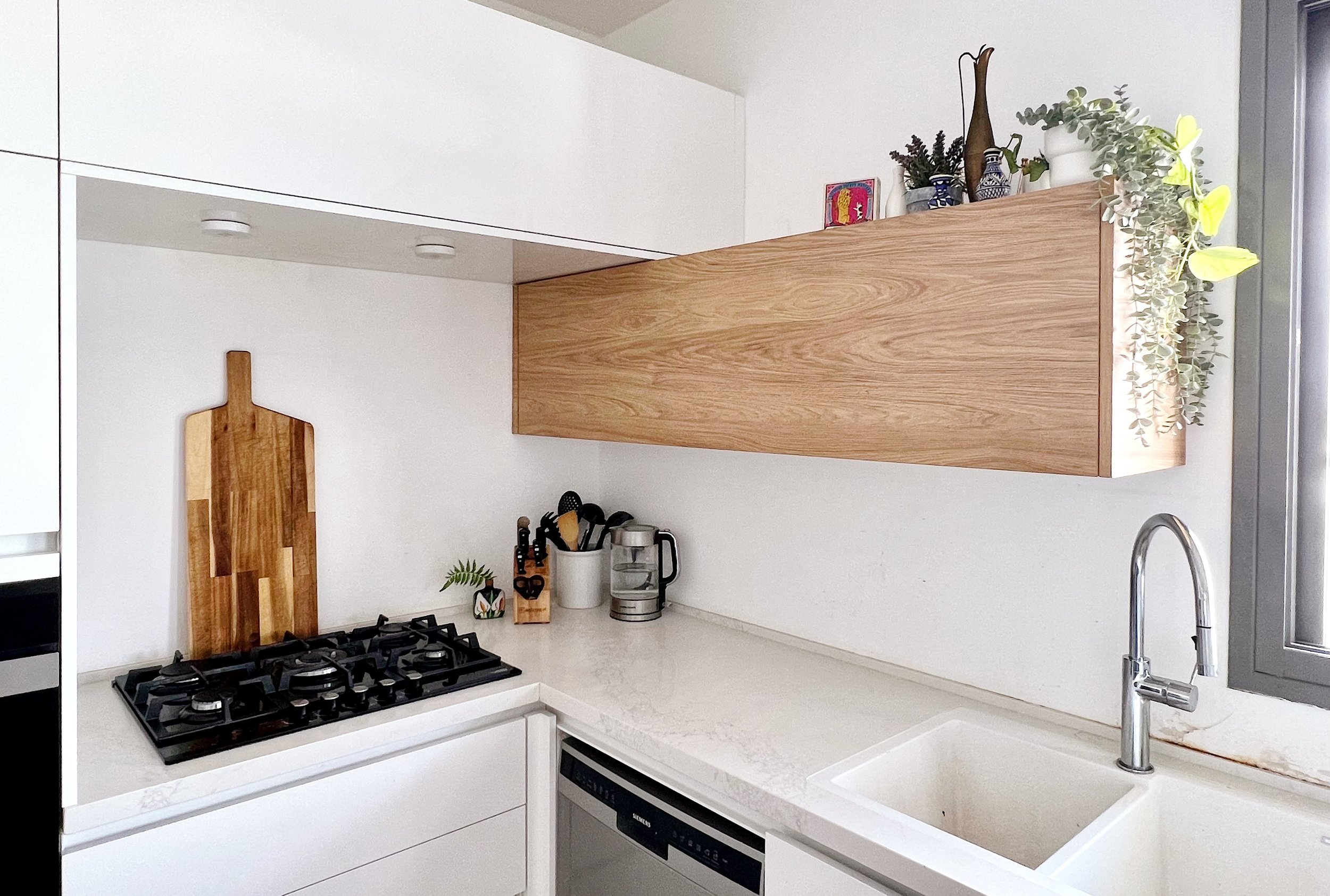
When we made Aliyah in 2021, we moved into a newly built apartment in Modiin fresh from the kablan (contractor). Because we’d been Airbnb’ing for 6 weeks already and I was 9 months pregnant, we were eager to get the keys, so the owner rushed the final to-dos and left the kitchen without a backsplash. As you can see below, this isn’t great for the wall behind the sink or the stove.
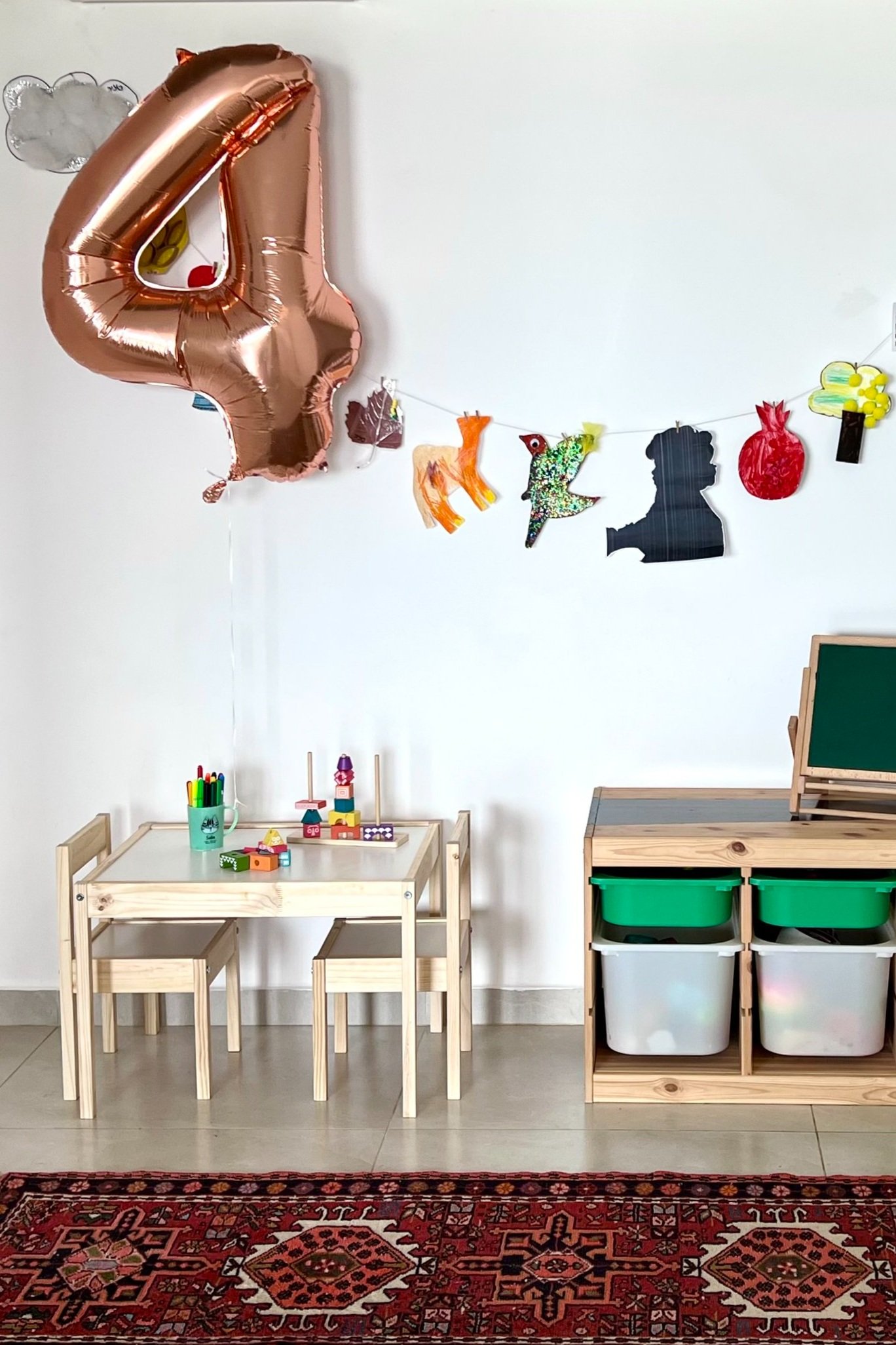
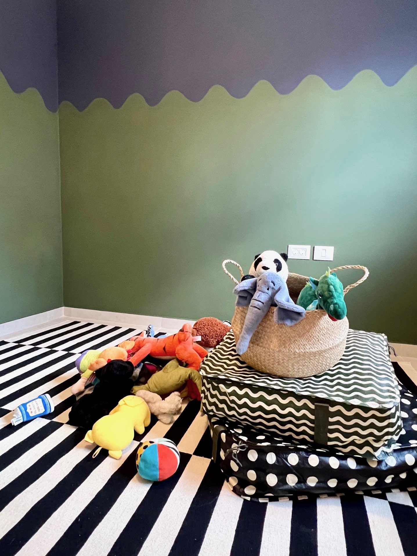
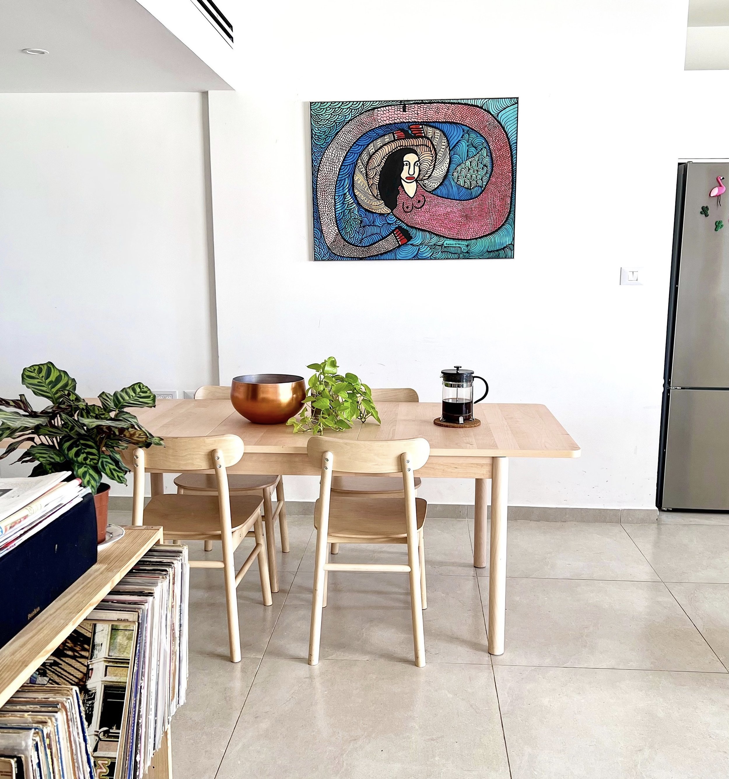
The owner is now selling the apartment and we’ll likely get the boot within a year, but I’m taking a trip down fairy tale lane to consider how I’d tile the backsplash. If we zoom out for a second you’ll see there’s already a lot going on in the living room and the surrounding areas:


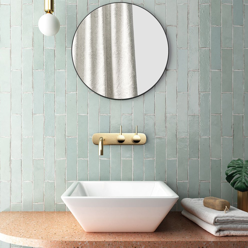
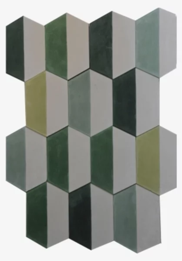
If I was to do a color, a green tone could be nice, to complement the plants and contrast the red and pink hues of the living room. I’d do a vertical or square pattern to balance the horizontal cabinetry. These mint tiles from Tile Israel could work, but I’d place them side by side rather than staggered for a more streamlined modern look. I really love these colorful green and white tiles from Balatot, but they’re too busy as pictured. Choosing just one or two of the tones could be fun. And I like these deep green squares from Milstone, but they feel too dark for this kitchen.
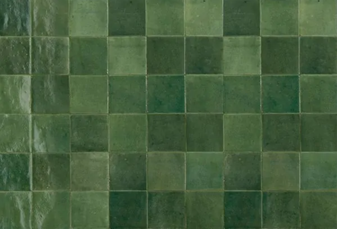
Here’s a test using just one of the green shades from the Balatot tile set:

If the white half of the tile is actually white and not grayish like this photo from online suggests, then I like it. This one requires some in person research, so let’s move on for now.

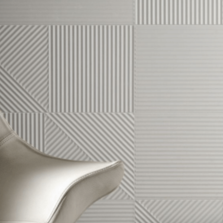
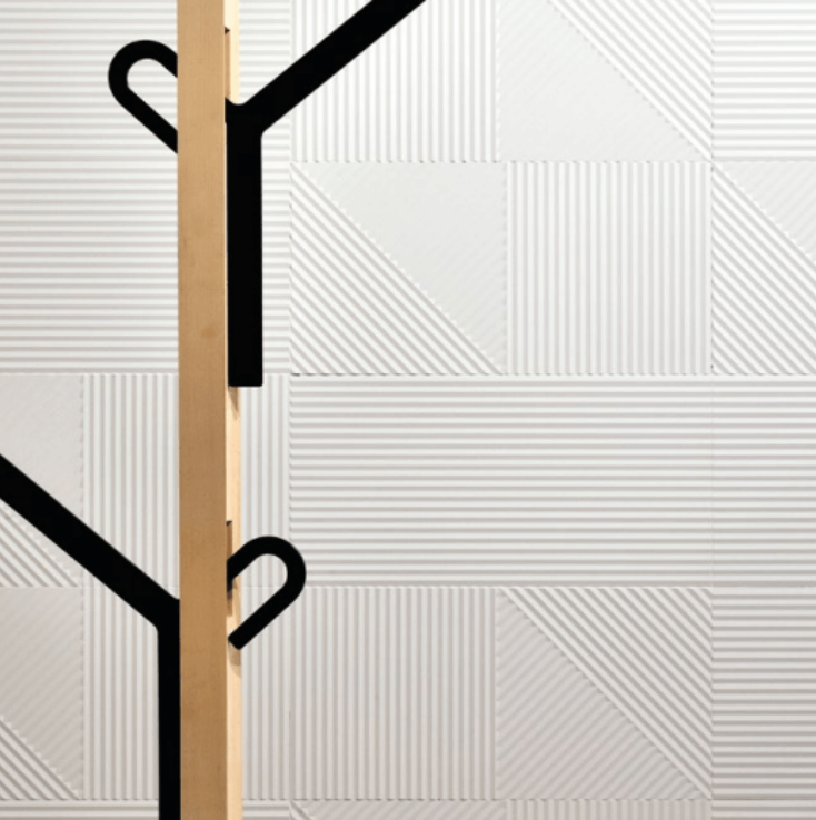
If I was to lay off the color and get white tiles, they should be matte, because the cabinets are already glossy, and white gloss on white gloss is overkill in this context. A plain white tile could work, but something with texture would be more interesting. I found this textured white tile from Studio Ceramica that looks wonderful:
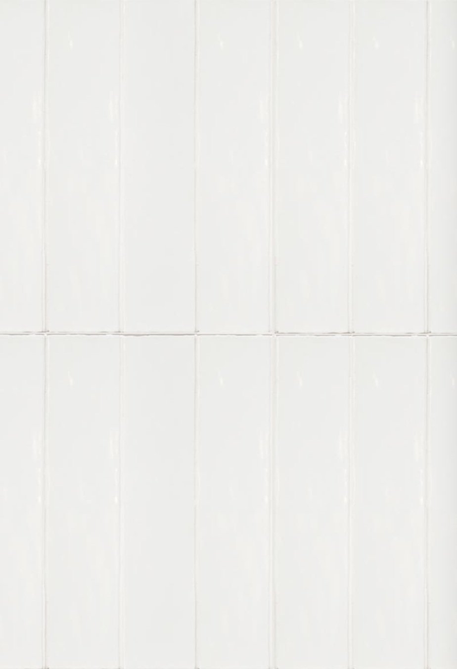
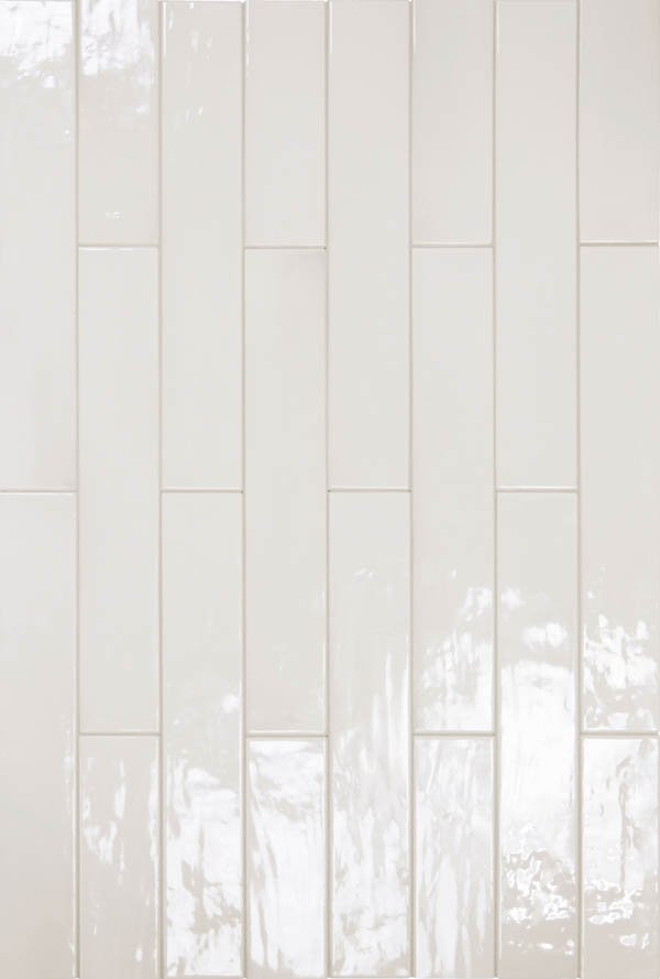
The downside is it’s probably terrible to clean and not ideal for a grease-catching kitchen backsplash. (I’d look into this further to be certain.) If we’re back to the drawing board with whites, these Milstone and Kal Vahomer rectangles are available in a matte finish and would be a simple elegant option, stacked cleanly like at left.

So that’s a workable white solution. But it’s a bit of a yawn. And while there’s nothing wrong with a good clean yawn in a good clean kitchen (I do love a white kitchen), I keep circling back to the tiles on speed, like this blue asterisk pattern from Milstone:
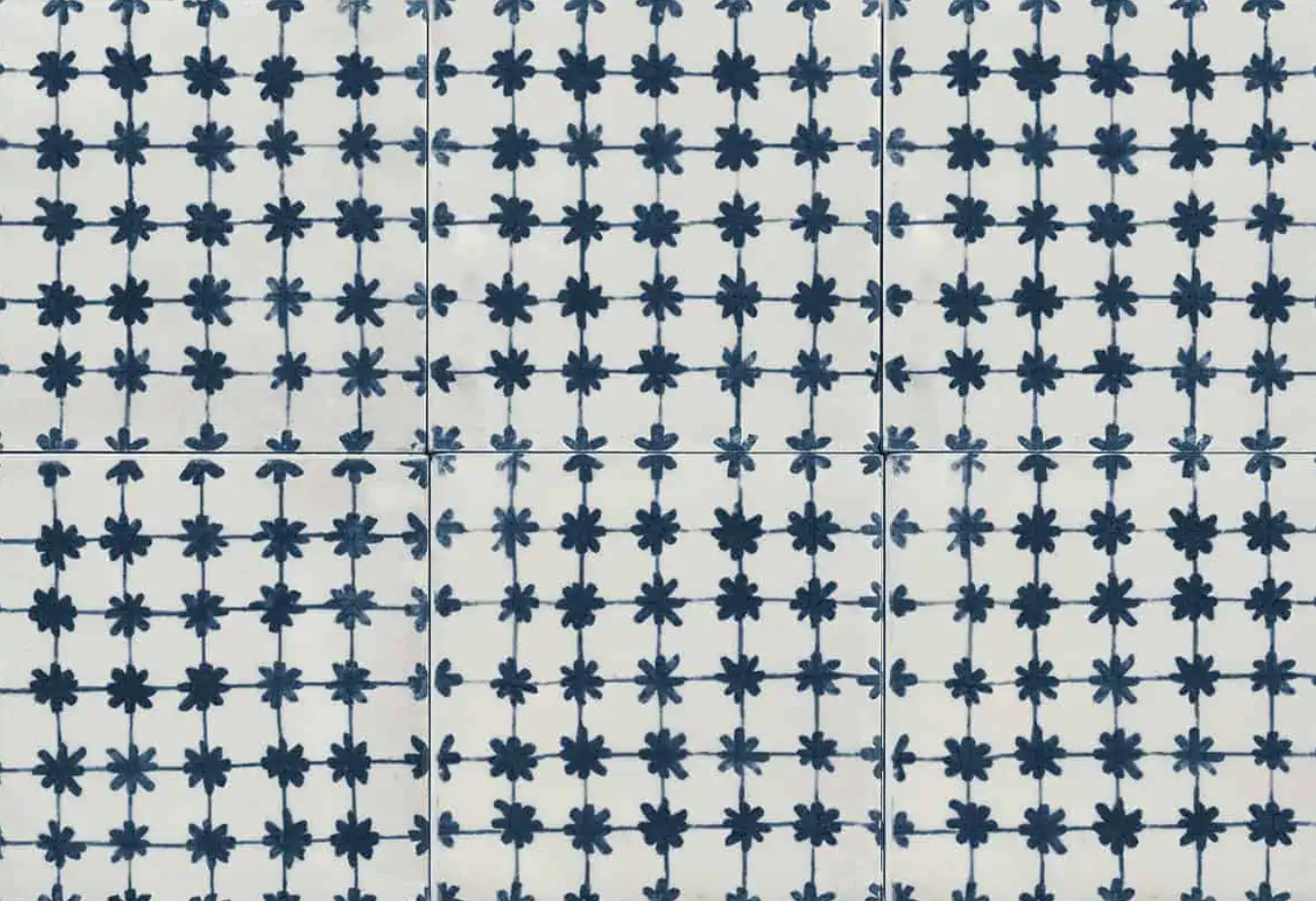
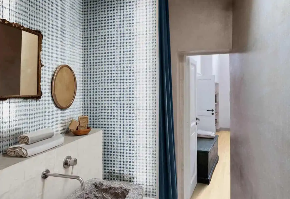
Testing it….

Kind of cute, no?
If I were really getting a backsplash right now, I’d visit tile showrooms in person.
Another option is to have the Caesarstone countertop continue up the wall, not have to choose a single tile, and live happily ever after.